Map Stuff Design System
Blog Homepage Link
Blog Post Link
Logo
The logo helps our users identify our brand when using our services.
Example
Colors
The colors set out below will form the base colors for all components, with a secondary palette introduced to complement primary colors where an alternate colour is required. Colors are presented here by their name and Hex value.
See Paletton, Colorpicker for data and Elegant Figures article for more info on how to choose a color palette.
Primary colors
color-primary
color-accent
color-neutral-200
color-neutral-500
Secondary colors
Text - color-neutral-400
Hyperlink - color-secondary
color-neutral-100
color-neutral-600
Tertiary colors
color-success
color-warning
color-error
Typography
Typography is the structure of every well designed interface. It is used to guide users through the interface and help them understand the logic behind the interface intuitively.
MapStuff uses Sacramento for headers and Barlow Semi Condensed for text.
Sacramento font on Google fonts
Type scale
The type scale goes from 6.76(px)(0.422rem) to 67.34(px)(4.209rem). Base size 16px, scale Perfect Fourth.
For @media screen and (max-width: 770px)the type scale goes from 11.24(px)(0.702rem) to 28.83(px)(1.802rem). Base size 16px, scale Major Second.
h1 heading - 67.34(px)(4.209rem)
h2 heading - 50.52(px)(3.157rem)
h3 heading - 37.90(px)(2.369rem)
h4 heading - 28.43(px)(1.777rem)
h5 heading - 21.33(px)(1.333rem
Paragraph - 16.00(px)(1rem)
Helper Text - 12.00(px)(0.75rem)
Copyright Text - 9.00(px)(0.563rem)
Extra Small Text - 6.76(px)(0.422rem)
Paragraph
Use tota11y to check elements contrast and accesibility.
Styling inline text elements:
You can use the mark tag to highlight text.
This line of text is meant to be treated as deleted text.
This line of text is meant to be treated as no longer accurate.
This line of text is meant to be treated as an addition to the document.
This line of text will render as underlined
This line of text is meant to be treated as fine print.
This line rendered as bold text.
This line rendered as italicized text.
Red text
Accent text
Black text
Blue text
Success text
Warning text
Error text
Red text
Accent text
Light blue text
Success text
Warning text
Error text
White text on red background
White text on accent background
White text on success background
White text on warning background
White text on error background
Code
Include rel="noreferrer noopener" along with target="_blank".
Links
Links are key elements for the navigation. Thanks to underscoring, they can easily be spotted by users.
Avoid opening links in a new tab or window. If you must use this behaviour, include the words ‘opens in new tab’ as part of the link.
If it’s an external link to a non-government website, make that clear in the link text.
Blockquotes
UV mapping is the 3D modeling process of projecting a 2D image to a 3D model's surface for texture mapping. The letters "U" and "V" denote the axis of the 2D texture because "X", "Y", and "Z" are already used to denote the axis of the 3D object in model space, while "W" (in addition to XYZ) is used in calculating quaternion rotations, a common operation in computer graphics.
Buttons
Buttons are action elements, they allow users to interact with the product. They can be of different sizes, colors and status.
Main buttons
The primary button is plain with a background. For the secondary button, the design system provides a second type of button called outline.
Primary button
Secondary button
Tertiary buttons
Predefined button styles, each serving its own semantic purpose according to the theme colors palette.
Success
Warning
Error
Success secondary
Warning secondary
Error secondary
Disabled
Button Size
Larger or smaller buttons.
Author Info
Author Info

Alexa Cristina • • 4 min read
Social Sharing
Social Sharing


Don't forget to share this post!
Cards
Cards
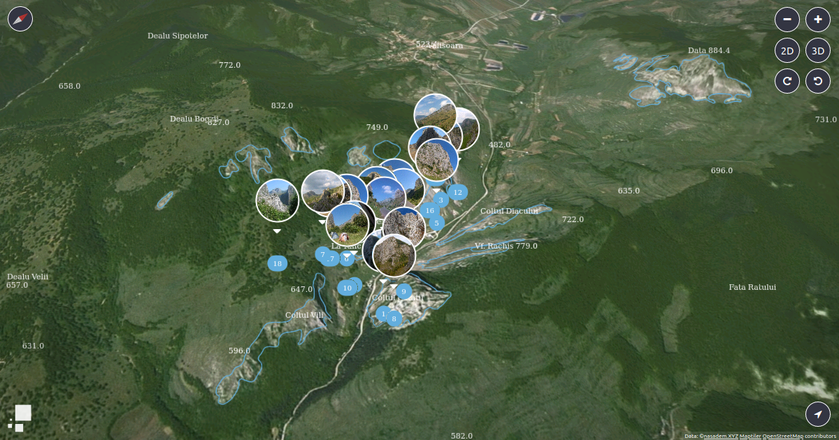
Procedural GL JS
3D map experiences on the web, written in JavaScript and WebGL.
Alexa Cristina • • 4 min read
Article
Article
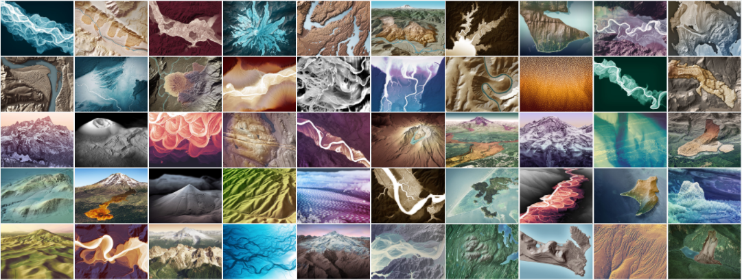
article-img

article-img-flex


article-img-flex gallery


article-tags
Page Breaks
Page breaks - after Bootstrap.
@media (max-width: 575.98px) {
  /* Extra small devices (portrait phones, less than 576px) */

}
@media (min-width: 576px) {
  /* Small devices (landscape phones, 576px and up) */

}
@media (min-width: 576px) and (max-width: 767.98px) {
  /* Small devices (landscape phones, 576px and up) */

}
@media screen and (max-width: 767.98px) {
  /* Extra small devices and small devices */

}
@media (min-width: 768px) {
  /* Medium devices (tablets, 768px and up) */

}
@media (min-width: 768px) and (max-width: 991.98px) {
  /* Medium devices (tablets, 768px and up) */

}
@media screen and (max-width: 991.98px) {
  /* Small and medium devices */

}
@media (min-width: 992px) {
  /* Large devices (desktops, 992px and up) */

}
@media (min-width: 992px) and (max-width: 1199.98px) {
  /* Large devices (desktops, 992px and up) */

}
@media (min-width: 1200px) {
  /* Extra large devices (large desktops, 1200px and up) */

}
Flex
Layout
mps-wrap-flex
mps-flex
nav-flex
nav-menu flex
nav-menu-list
mps-post-info-flex
mps-author-info-flex
mps-form-info-flex
mps-overlay-info
footer-inner-flex
footer-inner-flex-2
article-img-flex See Article img
Grid
Layout
mps-post-grid
mps-post-featured-grid
mps-post-grid.inversed
mps-post-recent-grid
mps-social-grid